Data and Graphics Challenge
Data 304: Visualizing Data and Models
Knaflic’s 6 step process
Step 1: Understand the context

Knaflic’s 6 step process
Step 2: Choose and appropriate visual

- What comparison am I trying to make?
- Do a data and graphics inventory to come up with ideas.
- Try multiple ideas and get feedback.
Knaflic’s 6 step process
Step 3: Eliniate clutter

- Elements of graphics can be turned off (or made transparent or muted).
Knaflic’s 6 step process
Step 4: Draw attention where you want it

- Leverage the Gestalt Principles.
Knaflic’s 6 step process
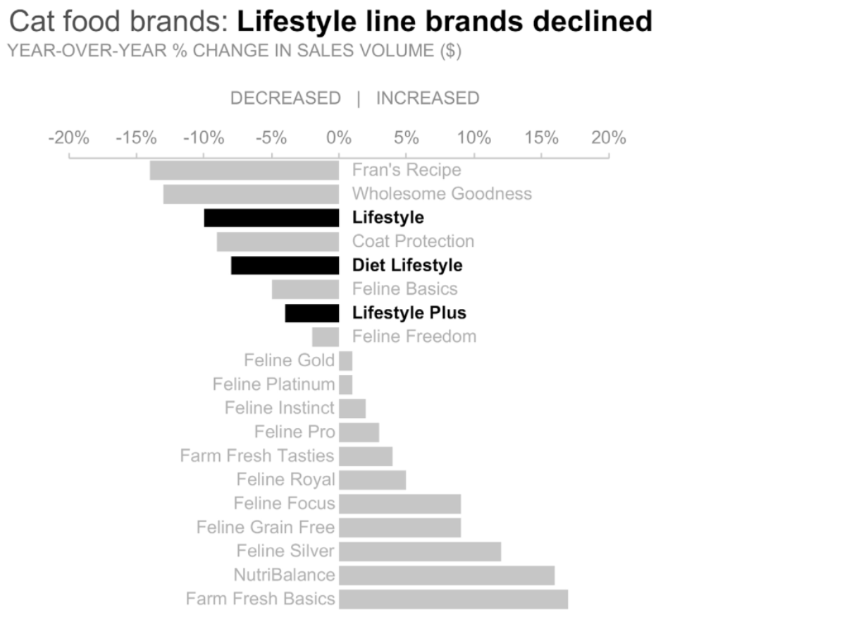
Step 4: Draw attention – Many ways
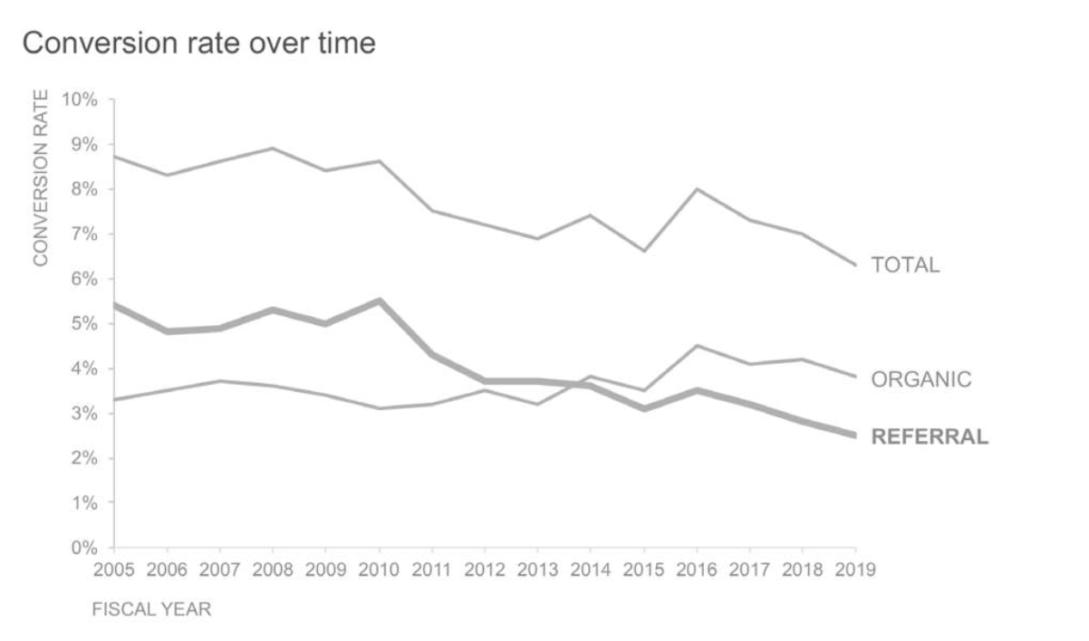
Figures 4.3f, 4.3j, 4.3m, and 4.3p from Knaflic (2020)…
Knaflic’s 6 step process
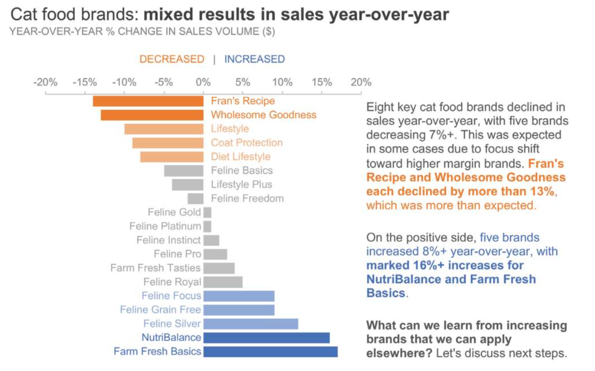
Step 4: Draw attention
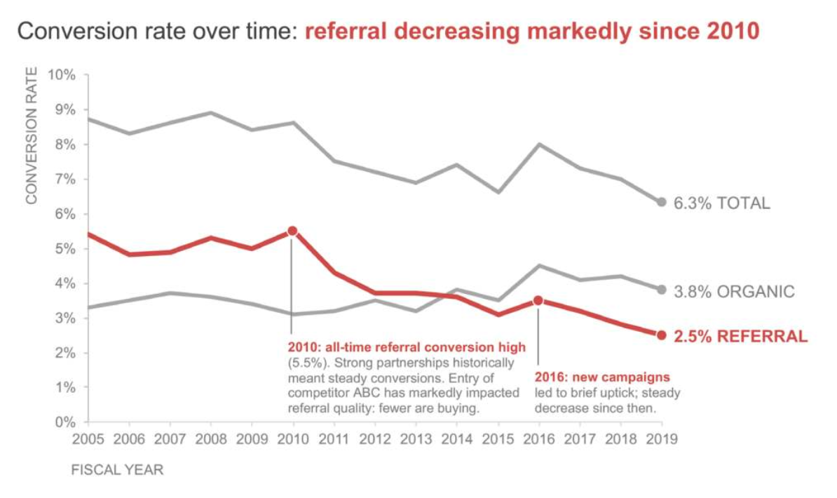
Connect to story
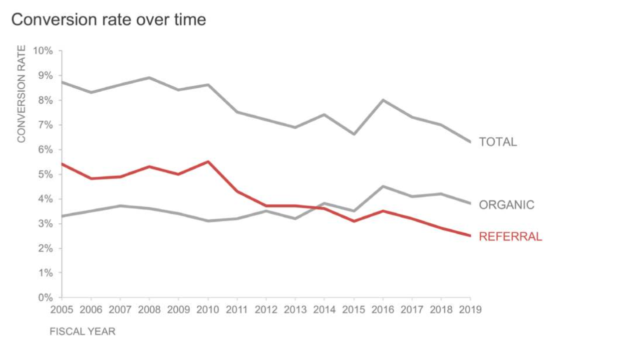
Figures 4.2b and 4.2h from Knaflic (2020).
Knaflic’s 6 step process
Step 5: Think like a designer

- Determine the Why before the What.
- First make the graphic correct and useful, then polish it.
Knaflic’s 6 step process
Step 6: Tell a story

- A graphic should tell (a part of) a story
- Titles and annotation text can be used to help tell the story
- Consistency across multiple graphics in a story helps
Manual Lima’s Information Visualization Manifesto (summary)

- Form follows function
- Start with a question
- Interactivity is key
- The power of narrative
- Do not glorify aesthetics
- Look for relevancy
- Embrace time
- Aspire for knowledge
- Avoid gratuitous visualizations
Asside: 2 Manuel Lima books


3 ways to think about ethics


- Deontological (arrow)
- Duty; does the action follow the rules/guidelines?
- Consequentialist (outcome)
- What are the consequences of this action?
- Virtue (doer):
- What kind of person would do this?
- What kind of person will I become if I do this?
Have paper and pencil ready
- draw sketches of graphics before trying to code them
- avoids wasting time making graphics you don’t want
- helps clarify the process/design
- draw “sketches” of data
- ideally, what would on row look like?
- what does one row actually look like?
- want adjustments do you need to make?
- do you need to combine multiple data sources?

Ask what before how
What do you want the computer to do?
- be specific (“make a plot” is not specific enough)
What does the computer need to know to do that?
- data, encoding channels, variables (fields), etc.
How do you get the computer to do that? (the code)
- Don’t write code until you have clear answers to 1 and 2.
The sketches you make will help with this.
Challenge #1: Email marketing
Context: Response and completion rates for an email marketing campaign where email recipients were asked to complete a survey.
Data Source: JSON, Excel, [HW 5, (Knaflic 2020, p 96)]
Challenge: Identify issues with this graphic and make something better. (See next slide first.)

Challenge #2: Customer Touchpoints
Context: Customer touchpoints (email, email, or chat) over time.
Data Source: CSV, Excel, (Knaflic 2020, p 206)]
Challenge: Identify issues with this graphic and make something better.

Challenge #3: Net Promoter Score
Context: Net promoter score over time for a company and its competitors.

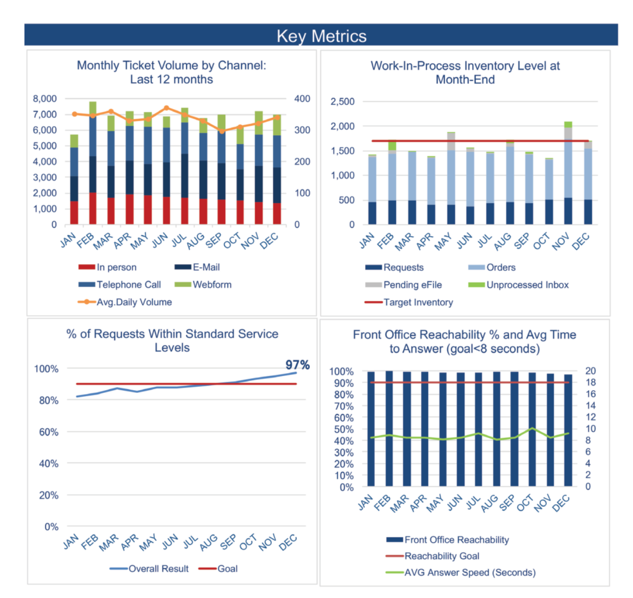
Challenge #4: Tickets
Here’s a page from a monthly report on ticket volume and related metrics. (Click on the image to see a larger version.)
 :::
:::