Design of Graphics
Good and Bad
Good and Bad
Data 304
Tufte: The Visual Display of Quantitative Information
Original in 1983, revised in 2001


Healy: Data Visualization: A Practical Introduction


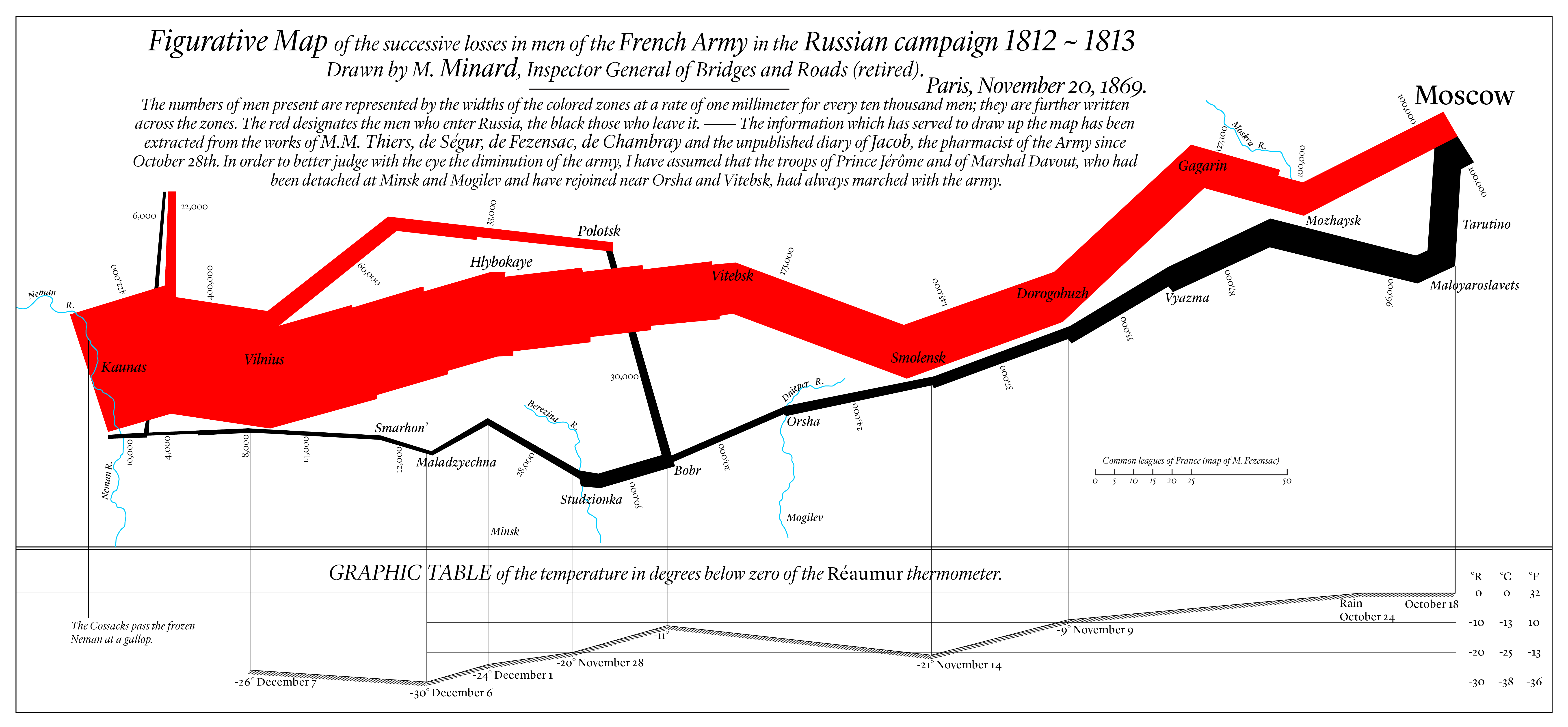
A Tufte favorite

- Charles Minard, 1869 (Click on image to view larger.)

More about Minard’s graphic
Learn more about its creator, Charles Minard, in this National Geographic article
See how to recreate this in R here.
Bad taste

The flip side

Even worse…
Even worse, it may be the case that graphics that really do maximize the data-to-ink ratio are harder to interpret than those that are a little more relaxed about it.

Bad Data
From (Healy 2019, 1.2.2):
 {.width=90%}
the survey question asked respondents to rate the importance of living in a democracy on a ten point scale, with 1 being “Not at all Important” and 10 being “Absolutely Important”. The graph showed the difference across ages of people who had given a score of “10” only
Another graphic
Showing average scores this time.
 {.width=70%}
Example: How tall are these bars?
